Since this is what I’ve been doing lately I figured I’d write another blog about it, but this one is going to be more technical. The first thing I want to tell you – something I learned the hard way – is that typesetting for print and for ebook are 100% different. No joke. If you aren’t going to be printing your book in hard copy then your typesetting is entirely different than it is for a physical book. How I learned this? By spending about four days bouncing off the walls because I couldn’t get my PDF to convert it into a format that didn’t look awful. Every time I tried to export it from InDesign into anything else the formatting was sloppy and horrible. There were random words in random places, page numbers on improper pages… it was nightmarish. So, to save you that frustration I now tell you the obvious: it doesn’t work like that.
Also in this blog post I’m going to discuss interior design, albeit briefly, because that is a part of the process. It, too, changes between formats which is one of the reasons you will notice that e-books tend to be more sparse on things like dropcaps and so on.
To me the easier of the two is e-book formatting, so I’m going to start there. After reading some tutorials online about going from a Word Document to an ebook I twitched. Going from Word straight to press? Perish the thought. The idea of doing that makes most typesetters green at the gills. However, for ebooks it proved to be the simplest way to accomplish the task.
The most important thing I learned about ebook creation is that, unlike traditional typesetting, there are very, very few page breaks. The reason for this is that on a device where the font can be changed and text made larger or smaller you can’t predict where the page breaks will be. As a result you should not insert them except at the end of chapters where you want to force the flow to switch pages no matter what font or size the reader is engaging at.
Secondly is don’t use dropcaps or other fancy formatting. It won’t carry over cleanly and will provide a massive headache. You can do simple things like adding in bullet points or maybe a horizontal rule, but it will be very difficult to have text boxes off to the side and so on without being far better at this than I am. As a result you want to limit yourself to as light formatting as possible. Stick to the usuals – bold, italic, underline, strikethrough. The reason for this is because when the Word document is exported through the conversion program it is changed into xhtml which is then read into .mobi, .epub, or whatever format you like.
If you have graphics you will want to keep them as simple as possible and avoid their use if you can because they may not align well. Epub is a rather limited file format, or so I am told, and it can’t really handle a lot of the things that we might want it to, so be careful what you attempt to do with it. I am sure that, with enough time and learning, those of you writing childrens’ books that are full color and illustrated could figure out how to make your pages look good in that format, but I couldn’t tell you right now how to do it. This is more for books that are a straight read and contain very few graphics.
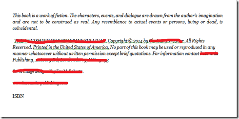
When you are done with your formatting the pages should look like this (without the red). They should be LEFT ALIGNED and have minimal formatting. This page has a page break before the first line and after the ISBN because it needs to stand alone in the book. I killed the personal information about this book because it’s not ready to hit the market yet, and this page may not be in its final form.
Finally, transferring your Word Document to the various file formats can be done in several programs. Calibre, for one, is open source and does a good job creating the files for you.
Traditional typesetting, however, looks much different and, unlike ebook formatting, should decidedly not be done in Word. As I referenced in my last post, I have developed a strong preference for InDesign as a typesetting program. It is a little less overtly friendly than MS Publisher, but it proved its worth to me in letting me have a project done in far less time than I could have anticipated otherwise.
When you are traditionally typesetting you must control leading (the distance between lines), kerning (the distance between individual letters), page breaks, page numbers, and everything else you see when you open the page of a book. Spoiler alert – there’s a lot you don’t even realize is there until you start doing it.
One of the biggest things you are going to be looking for during your typesetting process is eliminating widows and orphans. That is, lines of text leftover on a page or column when the rest has migrated onto the next page. A widow is a single line of text at the bottom of a page where an orphan is the same thing at the top of a page. They’re sad, lonely things and really should be with their families.
In addition to that you must work on designing the page layout for each page. The author’s name, the book’s name, the page numbers, the use of graphics on the chapter pages… all of these things are part of your process and are a lot of work. I’m not going to give you a step-by-step process on how to do this because there are better tutorials out there than I can provide that will center around your preferred software.

